
Good and bad posters
By far the most popular post on this blog is this one: Creating a Science Conference Poster with Inkscape. I have had mixed feelings about this for a while, because by now I think that the poster is not very good:
Don’t get me wrong, I still think it looks decent. But I made this as a part of a class project during my Master’s, before I had ever been to a conference (yet alone presented a poster). This has the effect that it just doesn’t work.
But let’s take a step back. What are science posters supposed to do? Here’s what I came up with:
- Attract initial attention.
- Ensure that people register your main finding, even if they just walk by.
- Tell a clear story of your research.
- Contain enough detail so you can use it to have a nuanced discussion during the poster session.
- Promote your publications.
- After the conference is over, act as eyecandy in the hallways of your institute.
I think the poster above does well in some of these points — it certainly catches attention, and it contains a lot of (too much) detail — but it does a terrible job at promoting the main results. Let’s fix that.
#betterposter — Less is more
#betterposter is a movement advocating for a new style of posters, sparked by this tweet:
Let's fix academic posters! Prepping a poster for #SIOP19 and sick of the old “wall-of-text” poster design? Watch this cartoon to see a new, faster approach to designing research posters. Includes templates. #betterposterhttps://t.co/wyXhiP5CKl pic.twitter.com/UBYB2GzIv9
— Mike Morrison (@mikemorrison) March 25, 2019
It also comes with this template:
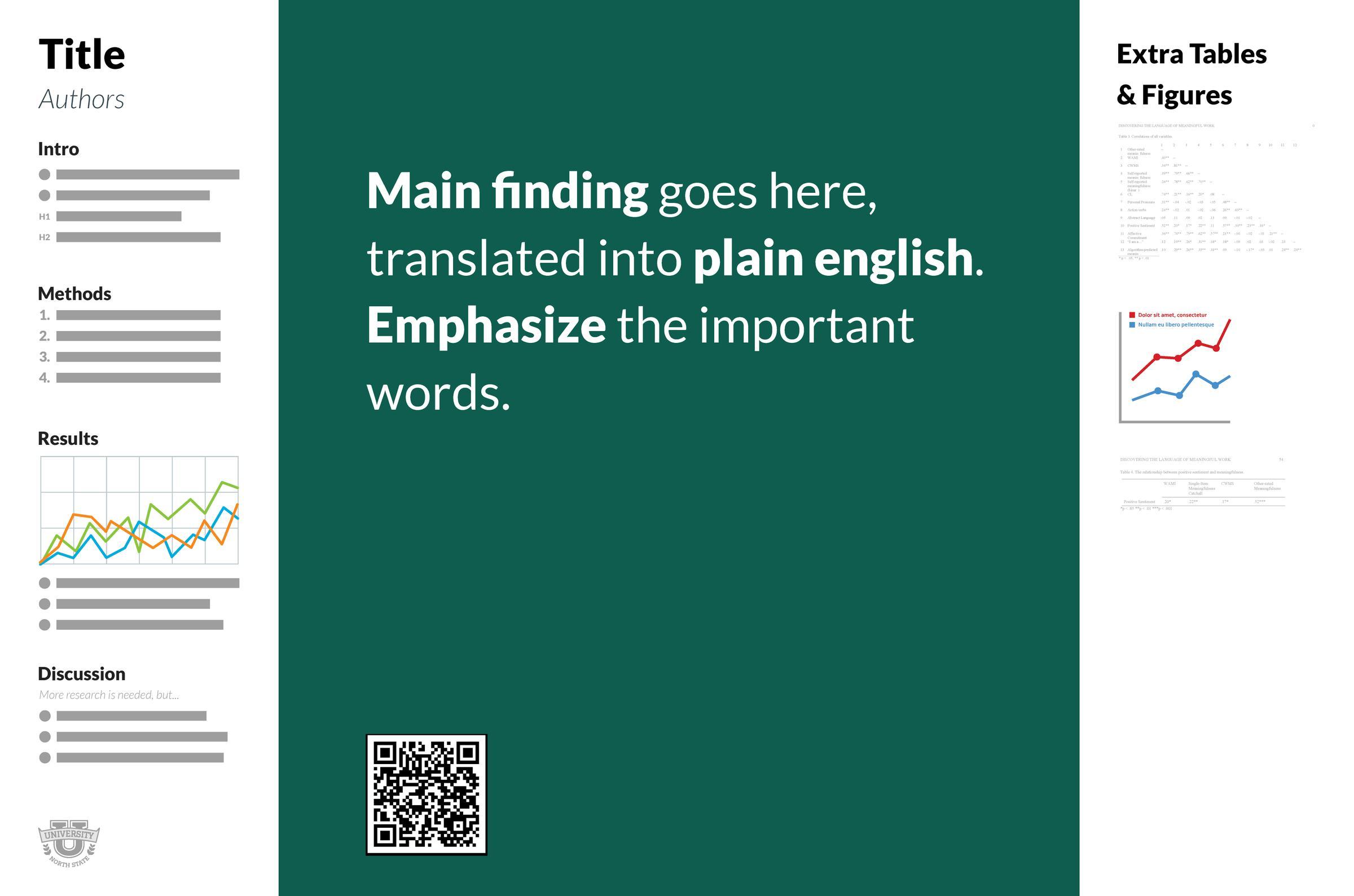
Now while I don’t think this is perfect, it does get so much right. Putting your main finding at the most prominent part of the poster is immensely helpful to promote your research to others, even if they just stroll by, and it helps you to tell a clear story in your poster.
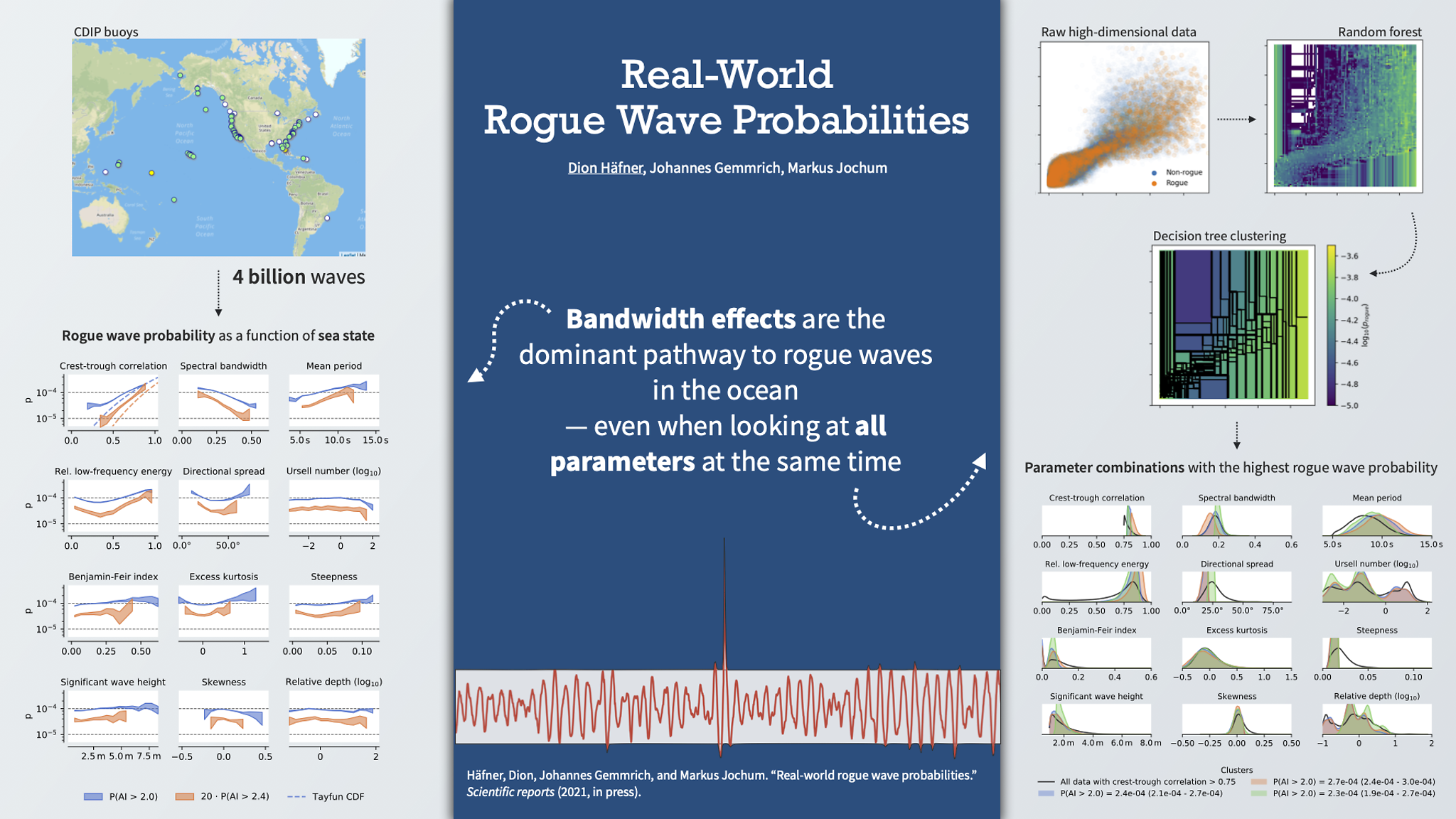
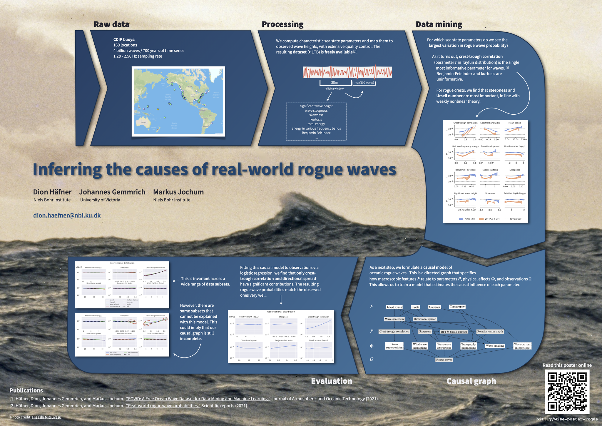
Inspired by this, I designed these 2 posters (presented at the virtual EGU general assembly 2021):
Keep in mind that this was a virtual conference, so these posters are optimized for screen reading rather than printing. For example, this means that they are in 16:9 aspect ratio (1.77 rather than 1.42 like A0 paper), and they contain less detail than I would put on a physical poster (because I only had a couple of minutes to show the poster).
Both posters worked great, and I had the feeling that people were generally engaged in the discussions. For the first poster I actually won an “Outstanding Student and PhD candidate Presentation” award at EGU 2021, so it seems like it served its purpose well.
So you like fancier posters?
Alright, I get it. Sometimes you need to feast your eye on something pretty.
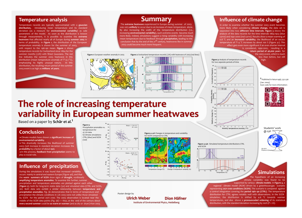
For a recent physical conference I wanted to see whether I could salvage the poster from my previous blog post. This is what I came up with:
This is closer to what people typically think of when they hear the term “poster”: Something that is nice to look at, and where the visual impact helps to drive the message home.
Compared to its previous iteration, this design has undergone significant changes. I removed all text boxes across the borders to let the design breathe and put the focus on the important parts. I personally think that the figures should do most of the talking, so all text on the poster just serves to explain what’s shown in the figures.
This time, I decided not to use a main finding as the title, simply because this is research in progress, so I don’t have a main finding yet. This was for a smaller conference with a higher ratio of experts among the attendees, so I think a bigger focus on details is fine in this case.
Unfortunately I couldn’t attend the conference, so I don’t know how it was received, but I am really satisfied with this design.
Which tool should I use?
My original post was about making posters in Inkscape, but I think that you can make great posters with any vector tool.
You can use Inkscape, the Adobe suite (Illustrator / InDesign), or a presentation tool like PowerPoint or Keynote. Actually, I made all posters above in Keynote, and it worked great.
My only piece of advice is: for the love of God, do not use LaTeX. I know there are some people who hate the thought of having to use PowerPoint for science. But LaTeX is just not a very good tool to make great posters. Posters have to work visually, which is super hard to get right with the edit-compile-review workflow. And things that LaTeX is great at (like page layouts) just don’t matter for posters.
Do yourself a favor and use a tool where you can drag a box around until it just looks right.
Now go and make your own!
Feel free to use my designs to make your own poster, and let me know if you want to show off your work or have anything else to add (e.g. in the comments or on Twitter).